Pancreatic Islet Illustration
Macroscopic to Microscopic view

💬 Context
In Twenty21, I wrote a scientific review paper which summarized our contemporary understanding of the unique and critical features of the pancreatic cells - called the islets of Langerhans - which regulates the blood glucose. This paper was written with dense text and to substitute/support some of the writing, I sought to design a biomedical illustrations of the relevant anatomical features. It was fulfilling and exciting for me to lead this project from concept → collaborations → publication/product delivery which ultimately served as a significant contribution to the diabetes scientific research field.
👨🏽🎨 Role
Scientist | Designer | Illustrator | Storyteller
💪🏼 Team
Illustrator: Rachel Chandler | Advisors: Cherie Stabler, PhD
🛠 Tools
Procreate | Illustrator | Adobe Color
⏰ Timeline
Feb, Twenty21 - Apr, Twenty21
🧐 Problem
Scientific Problem
Our knowledge of the pancreatic islets that regulate blood glucose is supported with tremendous amount of scientific literature. This knowledge exists in words that is full of jargons. In addition to the words, there are illustrations and images of pancreatic islets within the literature to support the writing. These visuals for the most part exists in black and white sketches or cross-sectional (2D) illustrations. This is in part because it is difficult to visualize the complex architecture of the pancreatic islets. Their complex architecture includes…
There is no such thing as a stereotypical islet
Pancreatic islets are 3D constructs full of thousands of single cells
They have various types of cells and they all look and function differently
There is an orchestra b/w their macroscopic and microscopic architecture, something difficult to visualize in a single imageChallenges
Lay Audience Problem
In Twenty16, I came into the diabetes research community not knowing anything about the pancreatic islets. How they look. How they function. How much do we know. How much do we not know. There is so much known science about these cells. Yet, it is not easily accessible to the lay audience at large. People with diabetes and their family know the role of pancreatic islets and what happens in the absence of these cells on the surface. There is a difference in knowing and seeing. Wouldn’t it be nice to better inform them of what islets are like and how they work macro- and micro-scopically? The notion that a visual medium of the sophisticated orchestra of pancreatic islets can better assist/inform the diabetic community is what gravitated me to address this problem.
Challenges
Compile/dig through the existing scientific research on pancreatic islets
Identify and chose key elements required for the visualization
Illustrate the native anatomy for both the expert and the lay audience
🔲 Design Process
Overview
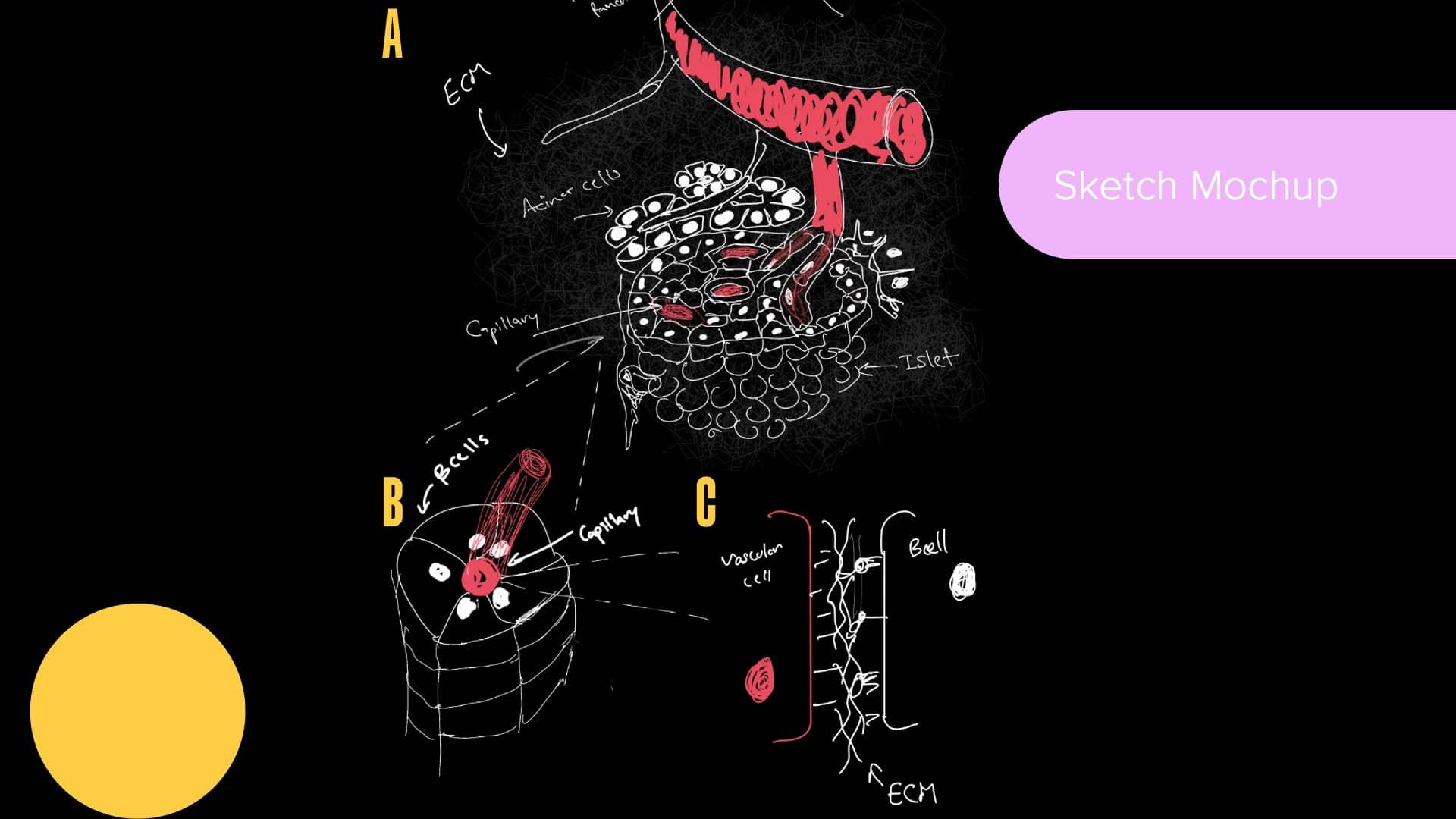
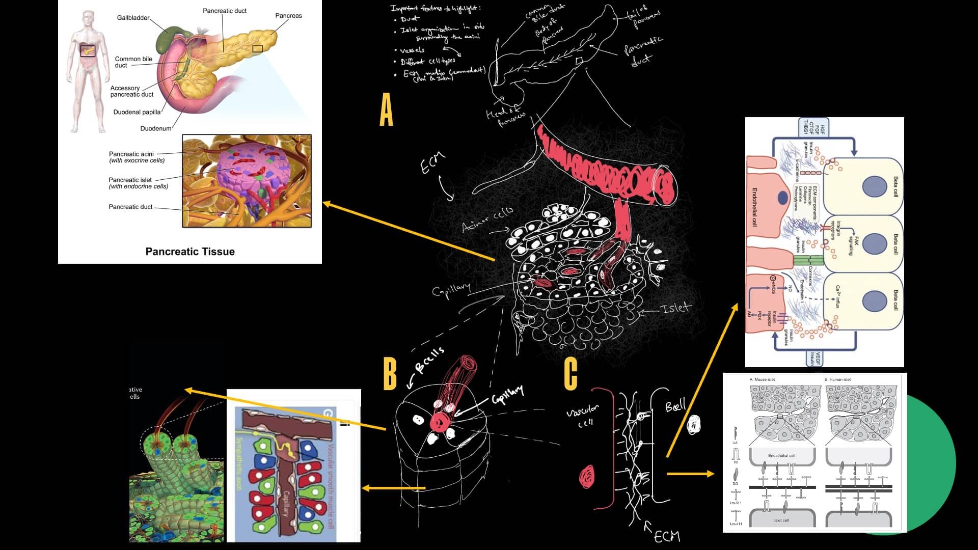
I started this project with an extensive research of pancreatic islet anatomical images currently present in the literature. I identified what is still relevant and which information is missing based on new knowledge we have to date (as of Twenty21). I then sketched out a draft that incorporates a the identified elements for the islet anatomy. I recruited and collaborated with a biomedical illustrator, Rachel Chandler, to come up with the final islet illustration.
Research
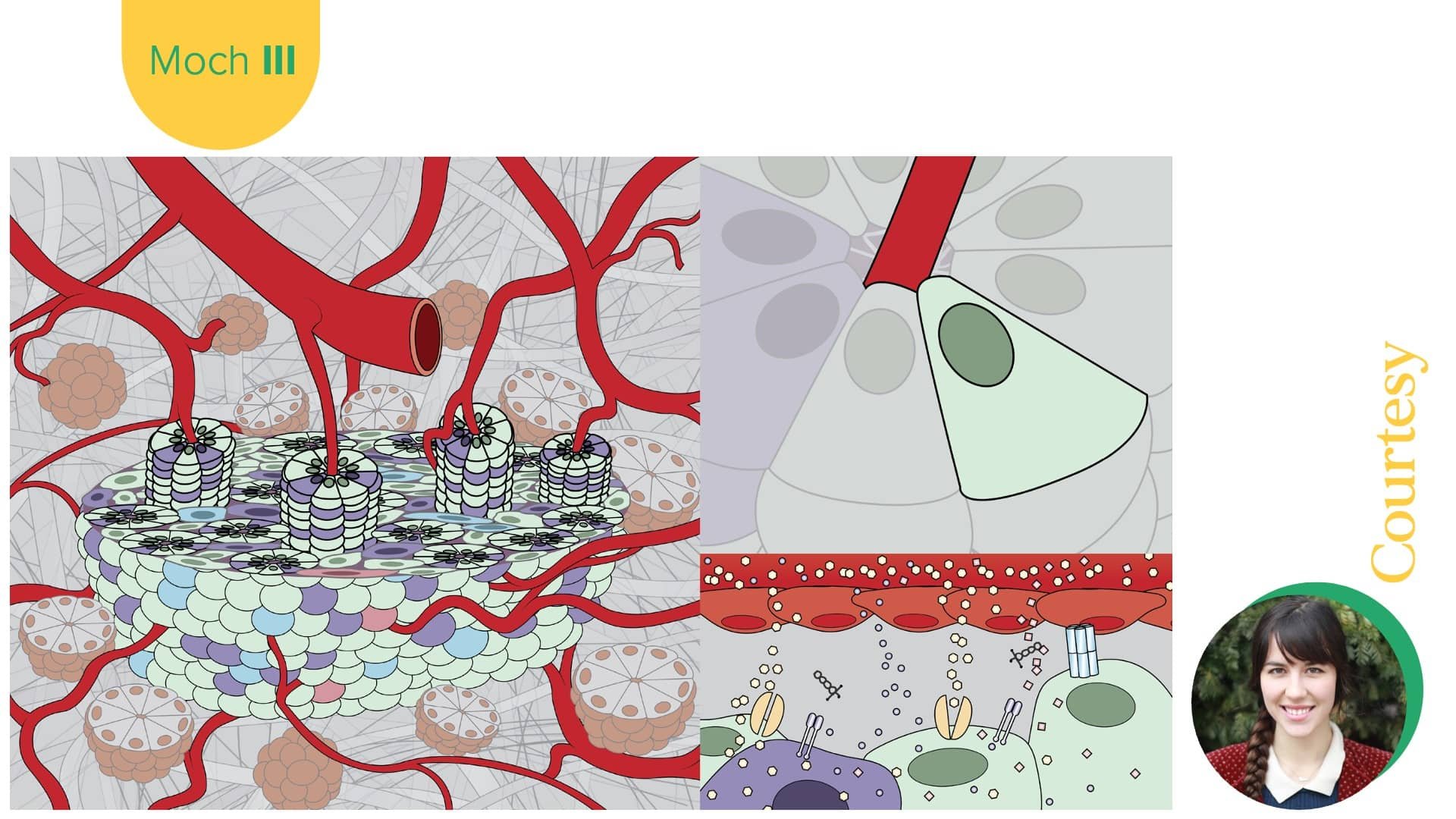
I assembled a portfolio of previous islet anatomy designs. Many consisted of rudimentary sketches (some still b&w) or cross-sectional (2D) illustrations. These images provided macroscopic view of the islet structure but failed to show single cell interactions at the microscopic level. I decided that my final design must provide various different perspectives of the anatomical structures (from a large overview → to a molecular level details).
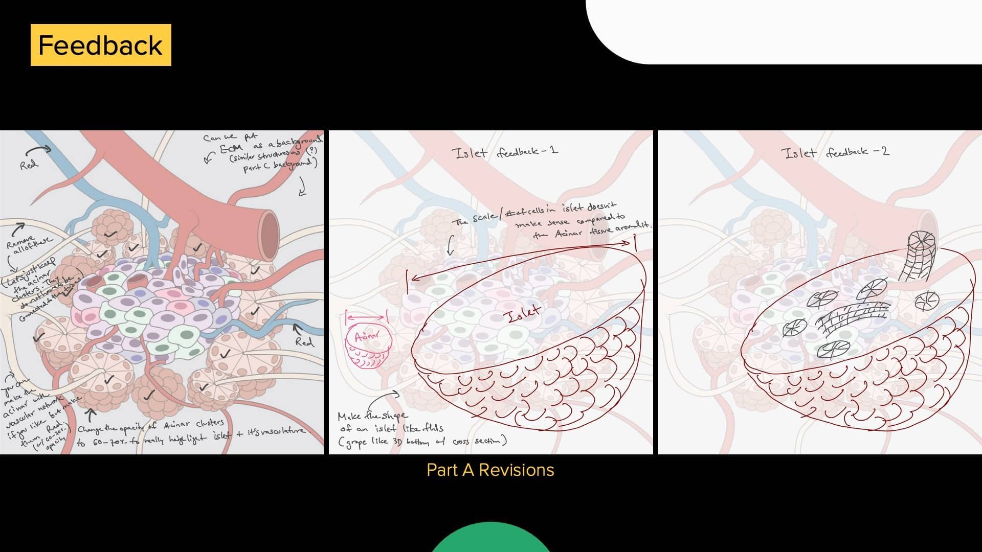
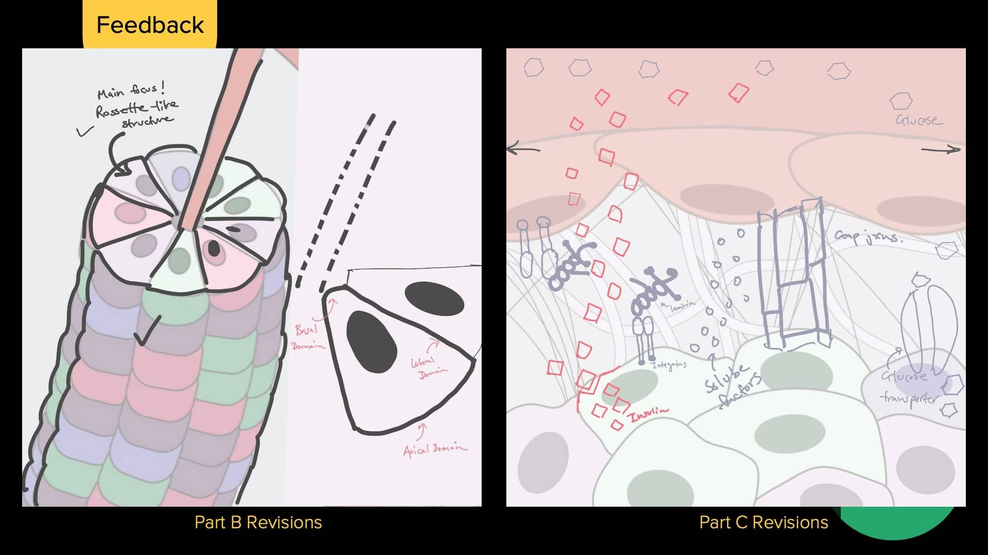
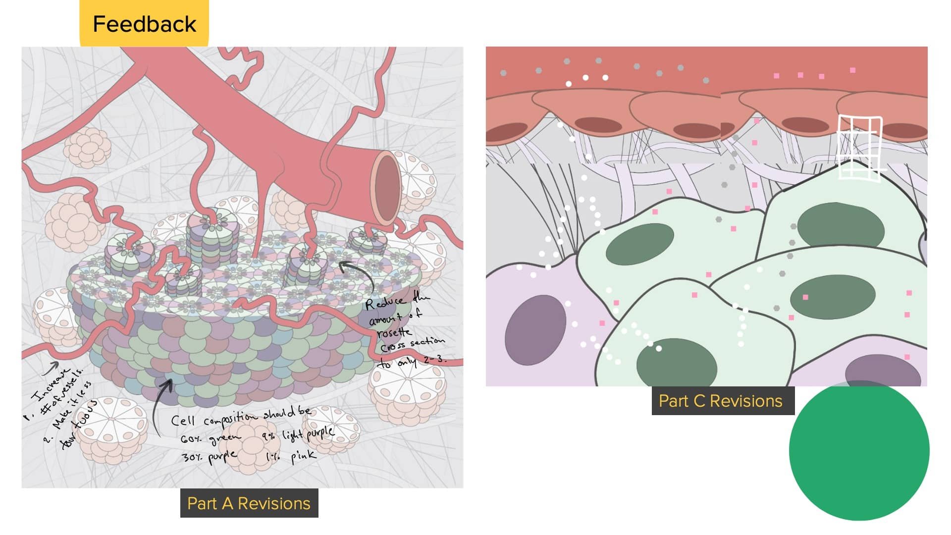
The Workshop
Rachel and I worked as a team to bring my low-fi sketches to high-fi designs. The complexities of the anatomical structures at different scales made it difficult to include all details in a sample image.
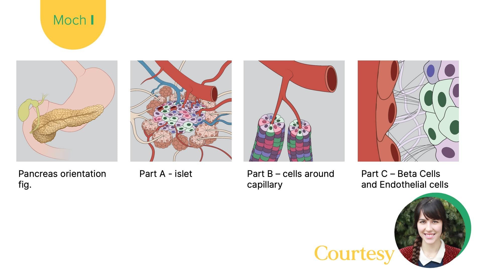
I overcame this challenge by splitting the figure in 3 major components. i) An overview image of the pancreatic islet. ii) Zoomed image of the cell-cell interactions (in a rosette structure). iii) Molecular level image where exchange of key metabolites between cells is visible.
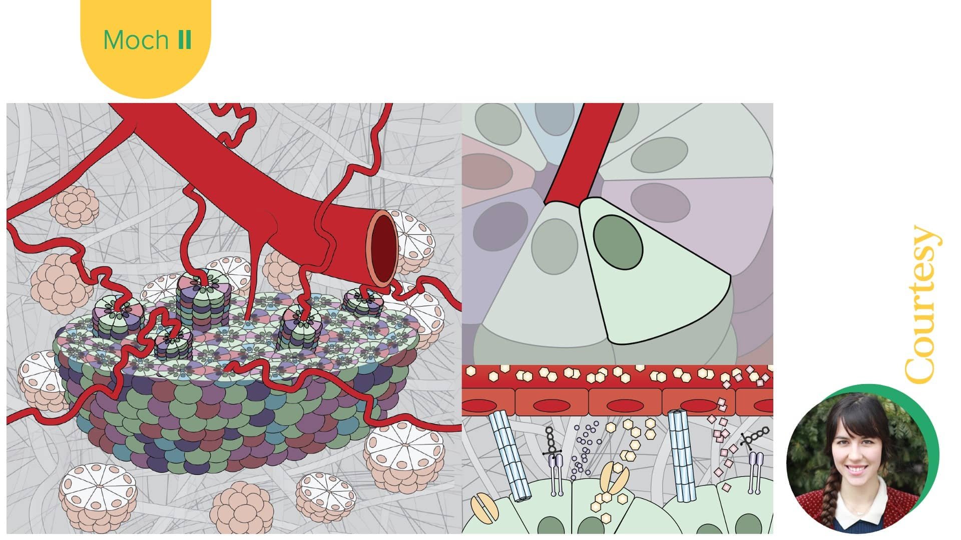
Here are key iterative mock-ups that Rachel and I produced.
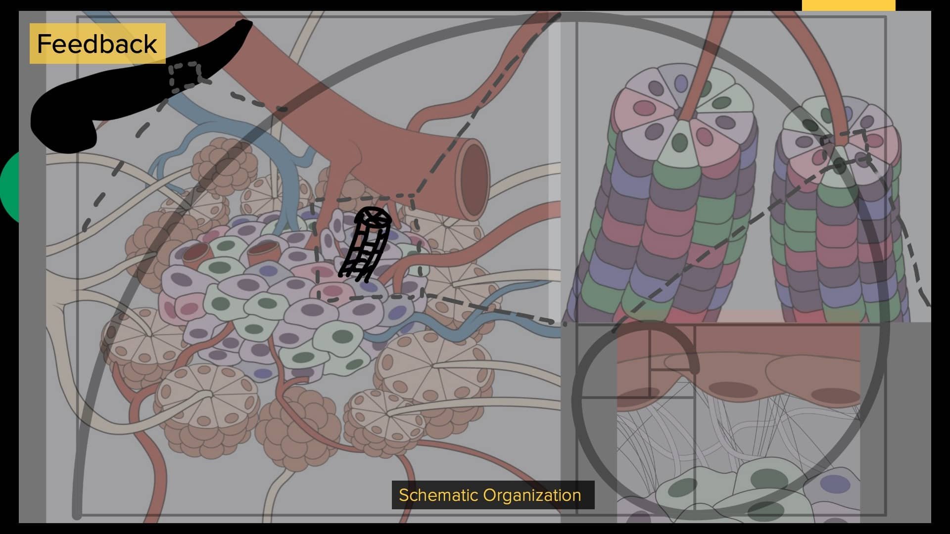
Selected Design

🤔 What is too much?
The Published Final Figure
🏆 This figure was published in an academic research magazine Frontiers in Twenty22
🔳 Design Decisions
I envisioned of curating a pancreatic islet image that has a fine balance of showing the complexity of these anatomical cells without being bombastic. Here are some of conscious decisions we made to overcome pain-points in our design process.
Cartoonize the image rather then designing realistic renders. This gave us freedom to make a ‘pop’ image that happens to be a biomedical illustration
Select a color-palette and use it to direct attention to the nuanced details. This resulted in image being soothing to look at yet being accurately detailed
Use opacity to be selective about what to highlight and what to keep in the background. This allowed for the main subject (for example, the islet in A and beta cell in B) to be clearly shown without any misunderstanding
🪔 Takeaways
To make your vision come to life, you have to seek help from other experts. Working with Rachel resulted in this project to flourish in an unimaginable way
A well designed biomedical illustration will live longer than a human life span. Do the due diligence, take in the responsibility, and design accordingly
Iterate fearlessly. Do not be afraid to go back to an old design if it serves the function well
Do not add more details to an already detailed image. Find ways to balance the picture
Why not browse more of my projects?
Tissue Chip Ad | Coffee Table Book | Studio Branding | 🔒 L7 HUB Design | Color-mapping Single Cells | Just Things