Coffee Table Design Book

💬 Context
I wrote a 222 page dissertation for my doctoral study. That’s cool but I knew that very few - perhaps nobody including myself - will ever read everything that I wrote. I took the challenge upon myself to translate my work into a design book. My premise was the following: If I format my dissertation in a book that I would want to place on my coffee table as a design book, then people (including myself) will be drawn towards it and read the work.
👨🏽🎨 Role
Creative Director
🗿 Client
Smit Patel, PhD
🛠 Tools
InDesign | Illustrator | Photoshop | Microsoft Word
⏰ Timeline
Jan, Twenty22 - Feb, Twenty22
🧐 Problem
Lay Audience Problem
Doctoral dissertation document is full of substantial contribution that a candidate has made to their field of study. Often, these documents end up staying at an institute, hidden in their locked electronic closets. If the dissertation is made public then one will find them in a dull format that is often composed in MS word with doubled spaced text and series of images at the end. Many institutes actually demand dissertations to be in such formats for standardization and documentation purposes. I understand the intention, but this approach leaves no empathy for the audiences/readers. How can anyone read hundreds of pages with scattered information and no visual appeals whatsoever? The intended reader wants access to information that may have been discovered by the author. But, the barrier-to-entry to search for a needle in a haystack is huge.
Objectives
Make information visually appealing with out modifying any of the text. Work with only what you have
Learn new concepts of “the gird systems” and apply it to draw attention
Format pages with caution for the limitations that come with printing documents
There are so many nuances within the text, how can I cleverly highlight them without burdening the eyes of the audience?
Design a cover page (front + back + spine)
🔲 Design Process
I used the design thinking approach and my strengths in systemization to approach this problem. I established typography and visual hierarchy guidelines for myself before beginning the project. This was my first major projects using Adobe InDesign and I replied heavily on creating “style masters” to ensure that I can seamlessly follow the visual guidelines.
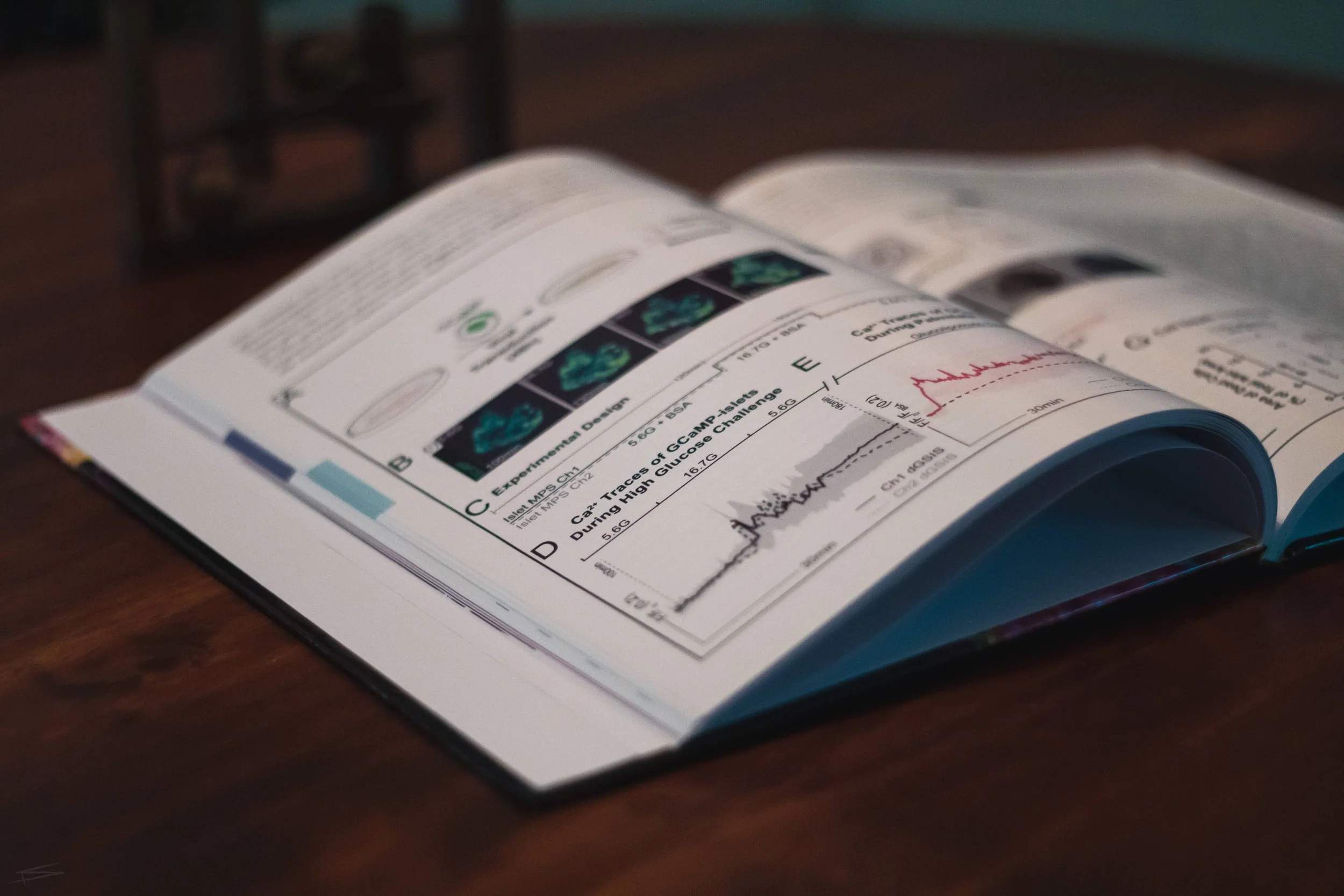
Combinations of serif and san-serif typography was used to clearly delineate different types of text. This approach made the content approachable. I assigned different colors to each of the chapters. To highlight the nuances and the connections between each chapters, I highlighted the text with a respective color when the information in that chapter is mentioned. I incorporated respective color bleed at the edges of the page for the reader to access a given chapter quickly. Each figure was purposefully displayed where the discussion of that information is discussed for ease.


Digital Renderings


/ Before

/ After
Cover Design
Once the book was digitally formatted, I designed the cover page for the book. I chose two images acquired during my PhD that represented the spine of my work. Typography that foreshadowed the content of the book was chosen. Finally, the spine of the book was designed to include relevant information (title, year, and last name). I worked closely with a publisher to ensure proper bleed and formatting of my digital document for the best outcome of the physical book.


🪔 Takeaways
The use of design hierarchy, typography, and colors to communicate complex information
The reader is smart so use Gestalt principles to interact with them through your design work
Book binding processes is complex but super fun. Definitely consult with experts in the field
Gained a thorough understanding of picking different weight of the paper, hard cover formatting, and full bleed printing processes
Why not browse more of my projects?
🔒 First Touch | 🔒 L7 HUB Design | Biomedical Illustration | Tissue Chips | Color-mapping Single Cells | Studio Branding | Just Things